LESSONS
Learning Intentions
You will:
Interpret scientific data by graphing real population estimates over time
Identify trends, turning points, and unusual changes in population data
Use visual tools (like graphs) to support evidence-based conclusions
Communicate what population data reveals about environmental change and recovery
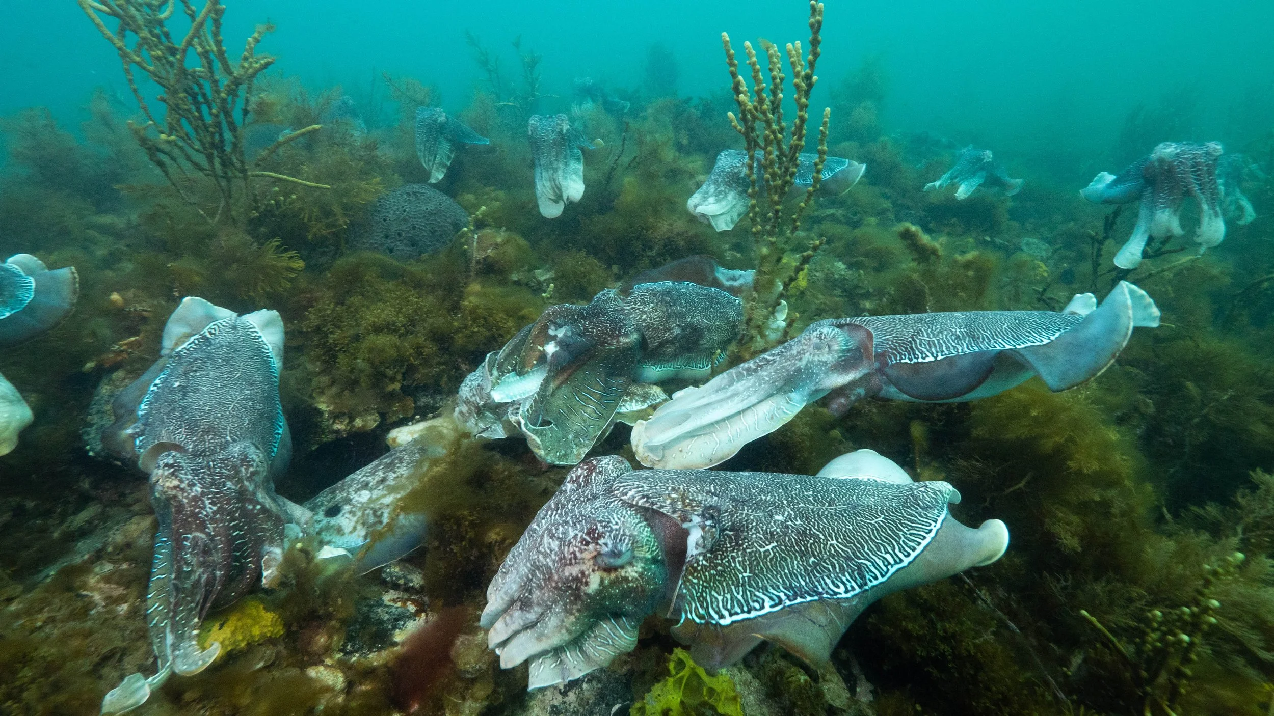
Cuttlefish Population Estimates (1999–2024)
| Year | Estimated Population |
|---|---|
| 1999 | 168,497 |
| 2000 | 167,584 |
| 2001 | 172,544 |
| 2002 | 160,000 |
| 2003 | 150,000 |
| 2004 | 140,000 |
| 2005 | 124,807 |
| 2006 | 120,000 |
| 2007 | 100,000 |
| 2008 | 75,173 |
| 2009 | 123,105 |
| 2010 | 104,805 |
| 2011 | 38,393 |
| 2012 | 18,531 |
| 2013 | 13,492 |
| 2014 | 57,317 |
| 2015 | 130,771 |
| 2016 | 177,091 |
| 2017 | 127,992 |
| 2020 | 247,146 |
| 2021 | 107,847 |
| 2024 | 81,420 |
Cuttlefish Population Interpretation
Tap an answer, then tap the matching question. Or drag and drop if you're on desktop.
Answer Bank
13,492
No
Boom and Bust
2020
Gradual recovery
1. What was the lowest recorded cuttlefish population between 1999 and 2024?
[ Drop here ]
2. Were population surveys completed every year from 1999 to 2024?
[ Drop here ]
3. What phrase best describes a cycle where population numbers rise and fall dramatically?
[ Drop here ]
4. In which year did the cuttlefish population reach its highest estimate?
[ Drop here ]
5. How would you describe the population trend from the lowest point in 2013 to the peak in 2020?
[ Drop here ]
GRAPHING ACTIVITY
Understanding big sets of numbers can be tricky — but putting data into a graph helps us see patterns, changes and trends more clearly.
In this activity, you’ll turn population estimates into a visual line graph so you can better understand what happened to the Giant Australian Cuttlefish over time.
By the end, you’ll be able to spot turning points, identify key events like population crashes or recoveries, and explain what the data reveals about this important marine species.

Instructions: Create a line graph showing how the estimated population of Giant Australian Cuttlefish has changed.
You can do this:
In your workbook using graph paper
On your device using a spreadsheet (e.g. Google Sheets, Excel, or Numbers)
Or with an online graphing tool such as chartgo.com or meta-chart.com
Tips:
Use these guidelines for your graph: X-axis = Year (from 1999 to 2024) Y-axis = Estimated Population
Label both axes clearly Use a dot or line for each data point
Make high and low points easy to see.
Self-Check: Does My Graph Show...?
- The x-axis includes the years that have population data
- The y-axis is labelled with population numbers
- Each data point is marked or plotted correctly
- My graph shows the lowest point in 2013
- My graph shows the peak population in 2020
- I used a line or dots to show the trend clearly
- The graph has a title
- The graph helps me see the changes over time
Bonus: Can I use my graph to explain what happened to the cuttlefish population over time?